Five Digital Mistakes to avoid in 2023
Author: Koji Kumpulainien
Disclaimer!
-
- It’s OK to make mistakes
- Do your best not to break these specific rules
- Innovation often requires us to break the rules
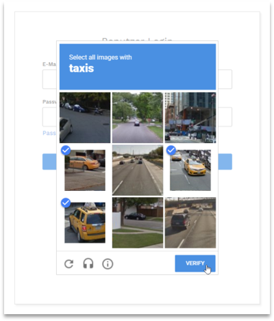
Mistake 1
CAPTCHAs (Completely Automated Public Turing test to tell Computers and Humans Apart)
Problems
- Not accessible
- Culturally biased
- Puts the burden on users
- Easy for robots, hard for humans
Alternatives
- Monitoring
- Scaling (containers and a CDN [content delivery network])
- Honeypot
- Multifactor or biometric authentication
- Limit IP addresses to U.S. only (if possible)
Mistake 2
Carousels
Problems
- A11y issues
- Low conversion rate; inefficient to complete tasks
- Slow load times
- Search engine optimization (SEO); poor markup
- Negative user experience
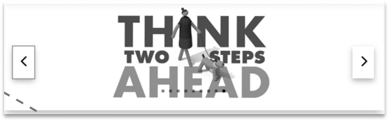
Alternatives
- Go vertical:
- Users accustomed to vertical scroll
- Optimize images suggest SVG format
- Use Cards:
- Calls attention
- Highlight an action
- Add imagery to blocks of text
- Other options:
- Use proper markup to optimize SEO
- Add meaningful alt text for images
Mistake 3
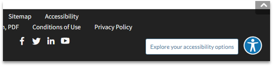
Accessibility Overlays
Problems
- Do not function
- “Fixes” disappear when the feature is removed
- Don’t prevent lawsuits
Alternatives
- Inclusive design
- Begin with accessible content
- Use HTML pages instead of PDFs (when possible)
- Use the latest version of the state template or the Design System
Mistake 4
Alerts, Banners and Icons
Problems
- Distracts from more important content
- Not many universally understood icons
- Makes the page overwhelming to view, use, navigate
- Less UX friendly
Alternatives
- Keep it simple
- Establish a visual hierarchy using:
- Different types of imagery (photos, illustrations, icons)
- Color (contrast must be ADA complaint)
- Size (must be legible no lower than 12pt. )
- White space! (Makes content stand out)

Mistake 5
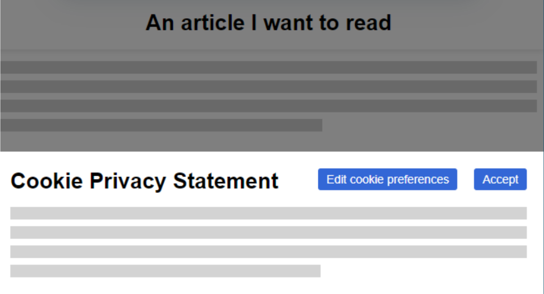
Pop-ups and downs: Cookies, Terms of agreement, You are leaving messages, Surveys, etc.
Problems
- Frustrating for users
- Users click without reading the agreement.
- A11y: some cannot be tabbed using a keyboard
- Increased interaction cost (makes people think)
- Like carousels, negatively impact SEO and performance
Alternatives
- Use appropriately (confirming an action that cannot be undone
- Use a separate page